Process: Research, Concept Development, Pencil sketch, 3-Column grid strategy, Adobe InDesign poster layout practice, Adobe InDesign typography poster, Adobe InDesign color variations with Adobe Contrast Checker, Adobe InDesign Social Media Campaign, Adobe Photoshop Mockups
Inspired by Swear Text, as the form spoke of visual reciprocity, I expanded the ideas. The goal of this expansion was to highlight graceful contours in surface design and artistically inform in a 5 x5 book on type. The book is a historical reference celebrating the evolution of form and its importance in the evolution of society.
Poster Series Mockups by Michelle Meyer
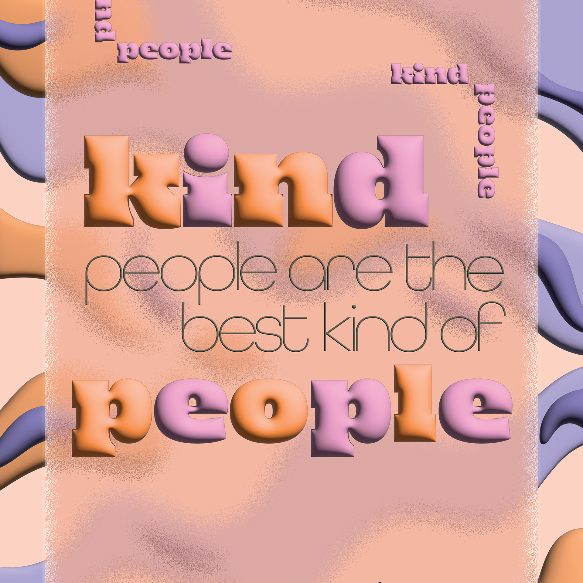
Swear Text from OHNO Type Co. brings a lot of variation & energy to what some see as a boring form of expression: typography. Dang it, are they wrong! Edmondson's company jumps off of any medium, outshining illustrations and photographs.
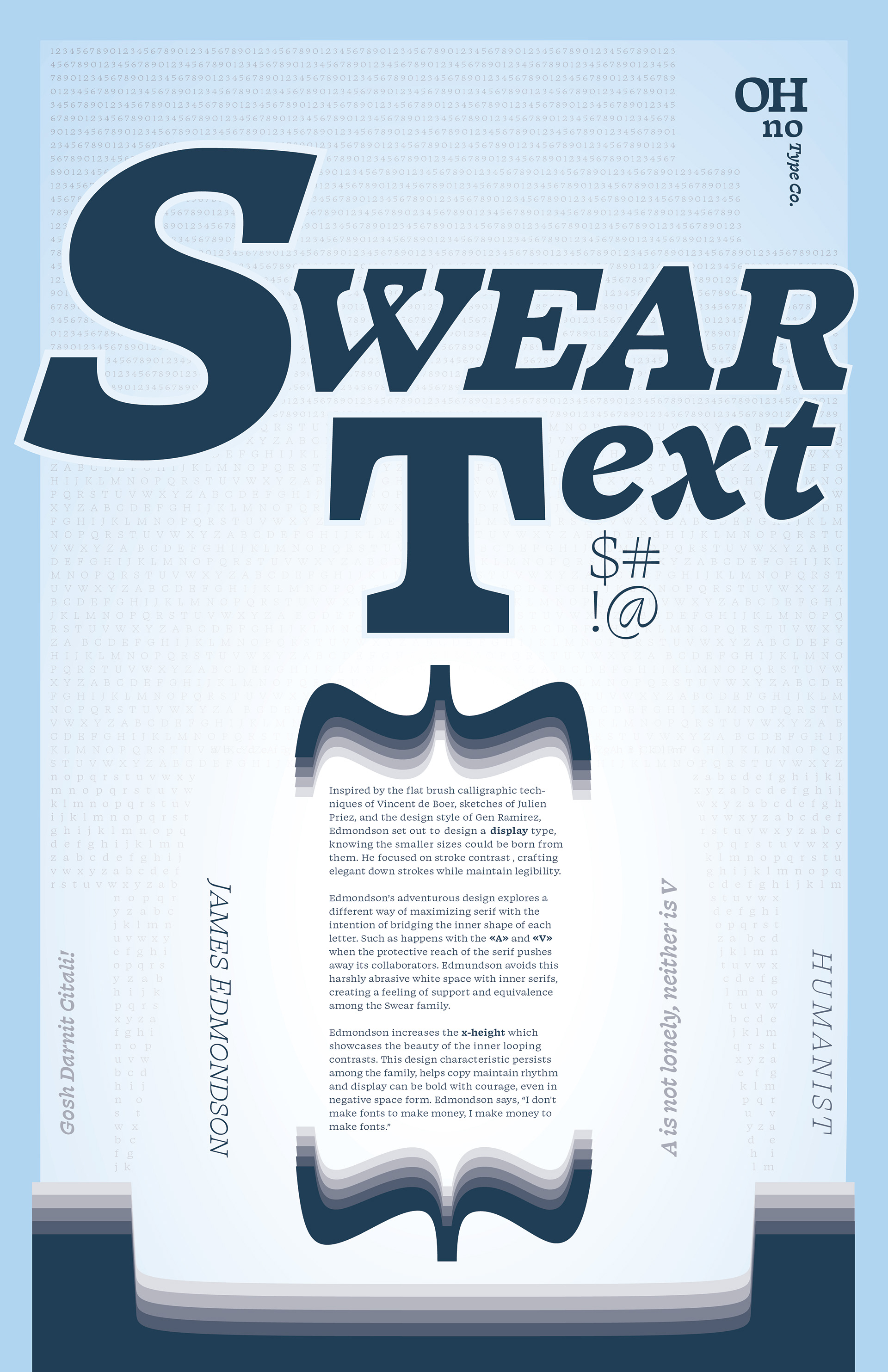
11 X 17 CMYK Art & Design by MICHELLE MEYER
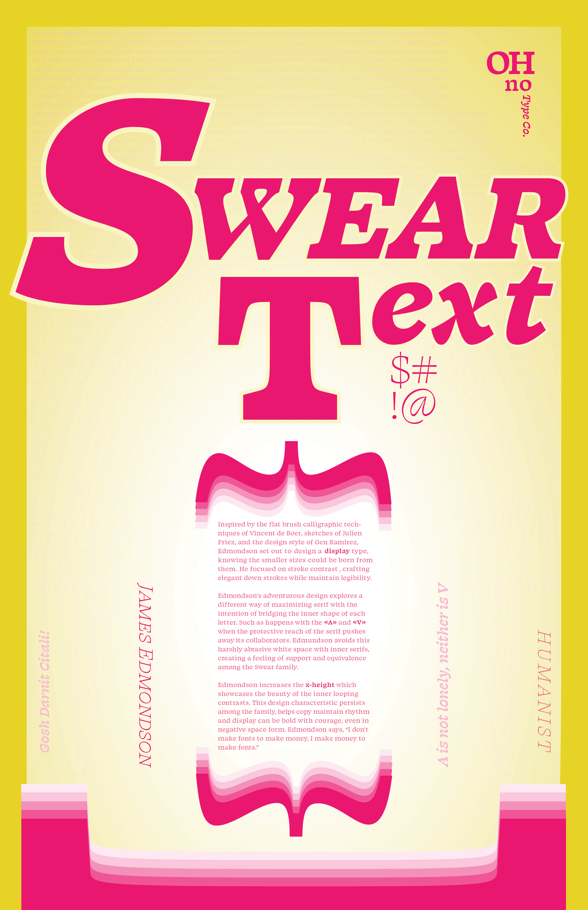
11 X 17 CMYK Art & Design by MICHELLE MEYER
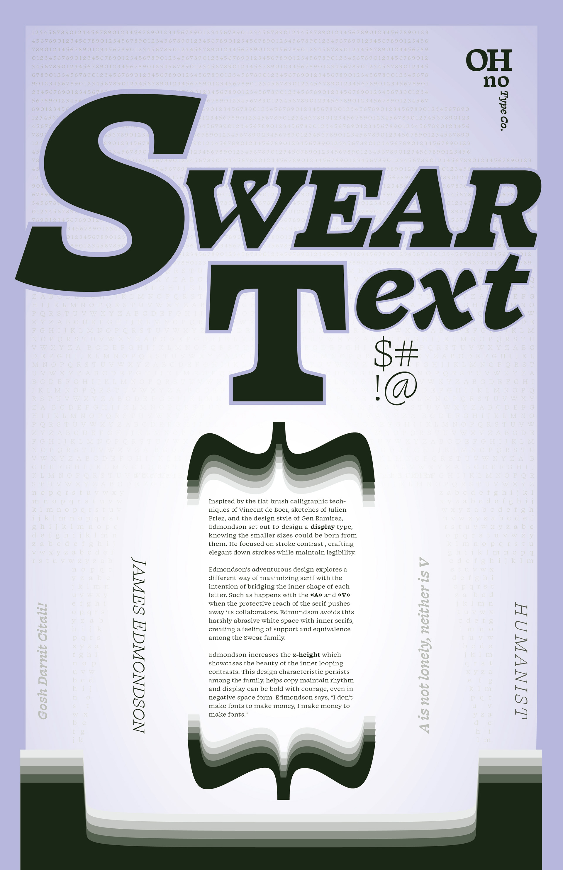
11 X 17 CMYK Art & Design by MICHELLE MEYER
My Process
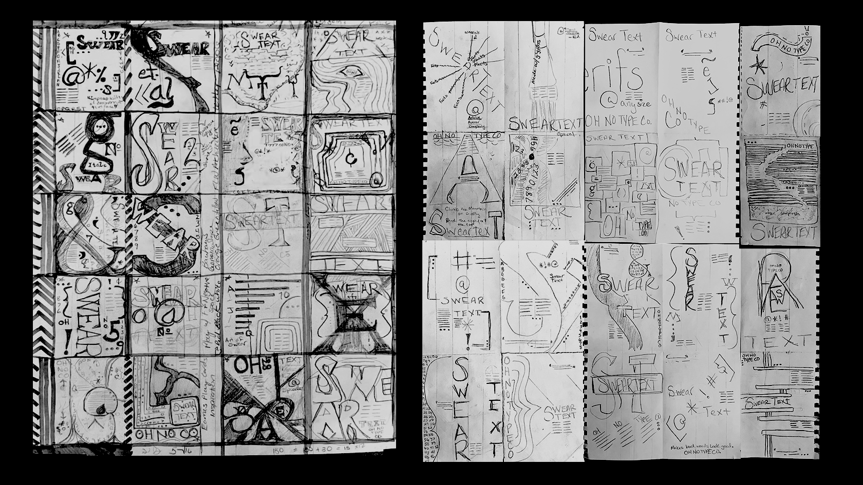
Sketches by MICHELLE MEYER

Inspiration, Research, & Early Designs by MICHELLE MEYER
Poster Series Mockups By Michelle Meyer
Swear Text works in every environment, designed for every surface. Words in Swear Text can season the street & elevate corporate space. Swear Text brings the human curve back to the written word. So lucky to work with such dexterity!!
Geek on type!


