Process: Research, Concept, Sketch, Review and critique, Key visual experiment in Adobe Photoshop, Review and critique round 2, Choose visual direction and typography, Prep assets in Adobe Illustrator, Draw 11 X 17 CMYK Poster in Adobe Photoshop, Migrate concept to horizontal Facebook event ad
Mockup Designs by Michelle Meyer
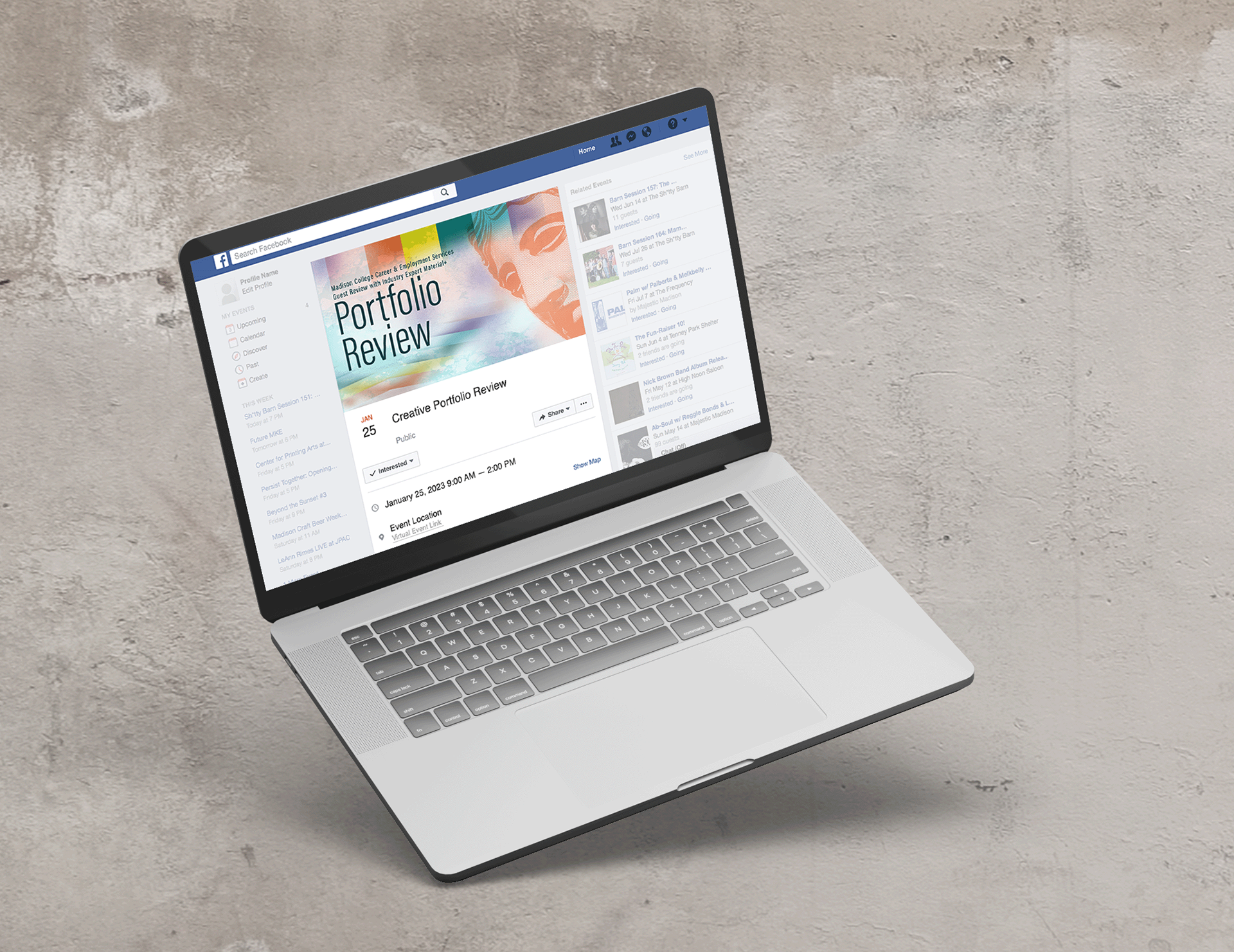
Facebook Ad Art & Design by michelle Meyer
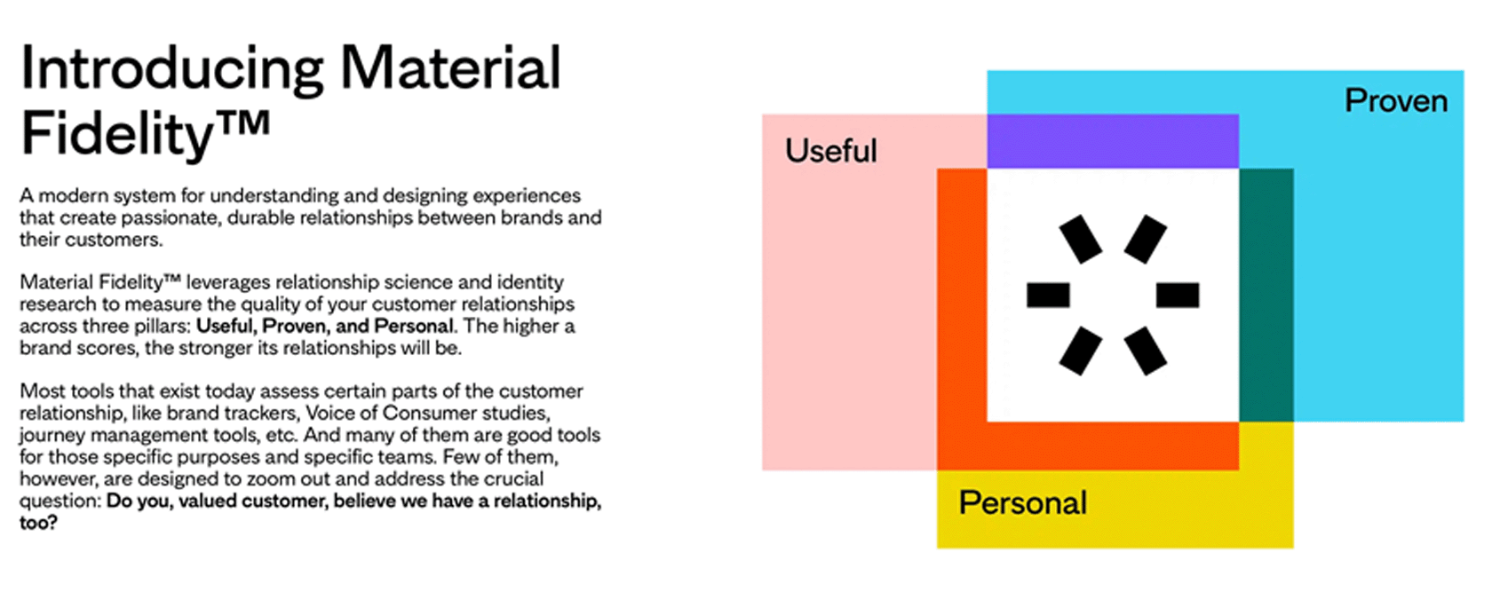
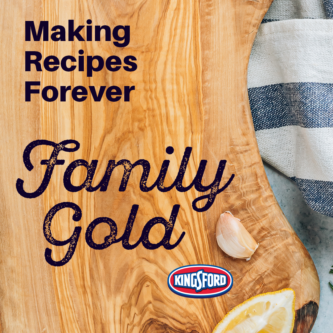
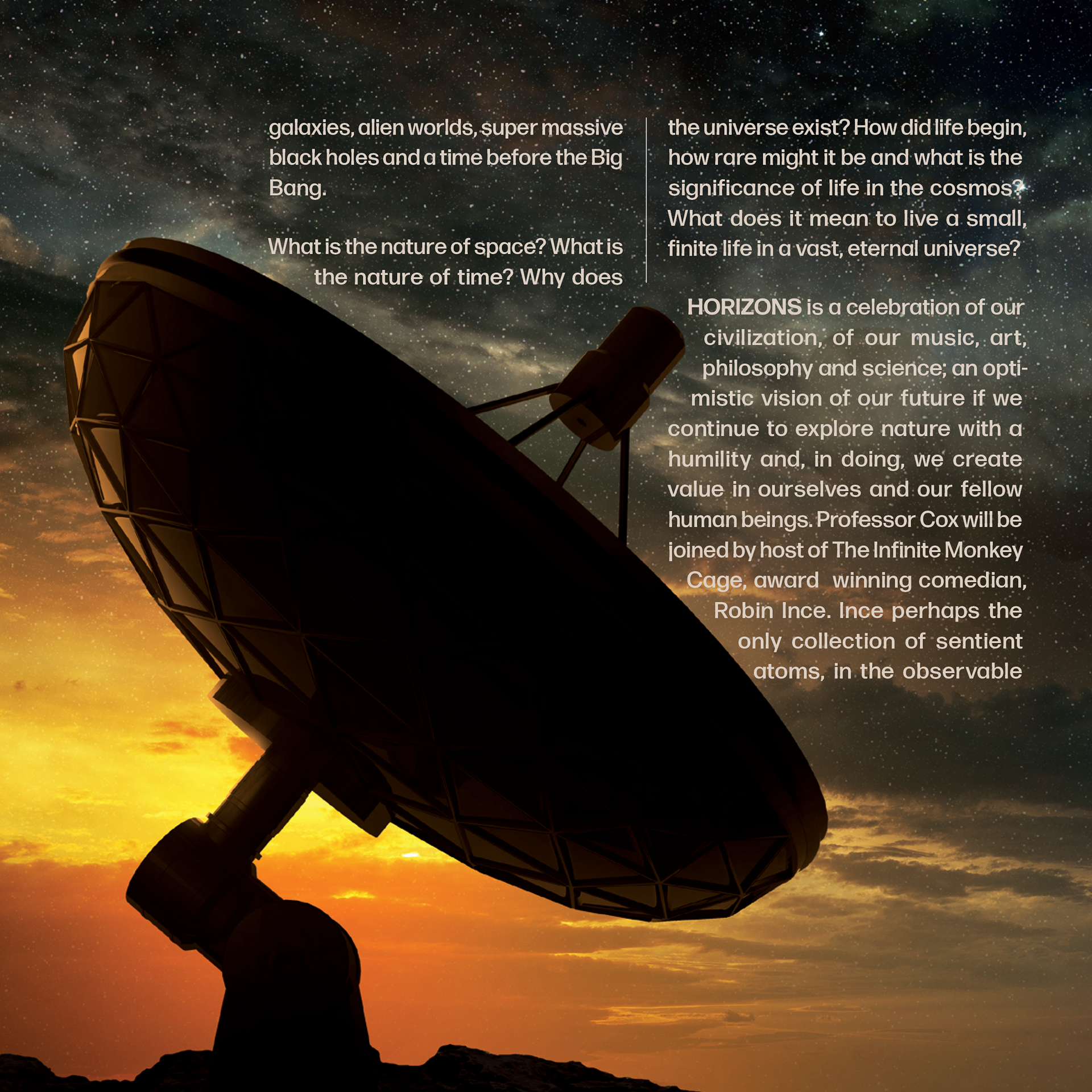
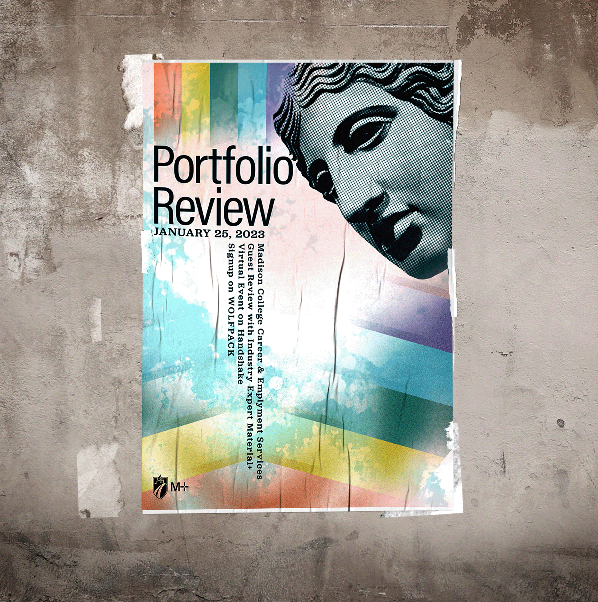
Cohesion of aesthetic is the essence of event branding. Spacial relationships & mapping experiences from print to digital change shape. Except, the mediums maintains consistency: representing the rainbow super hero vibe of Material+ design from medium to medium.
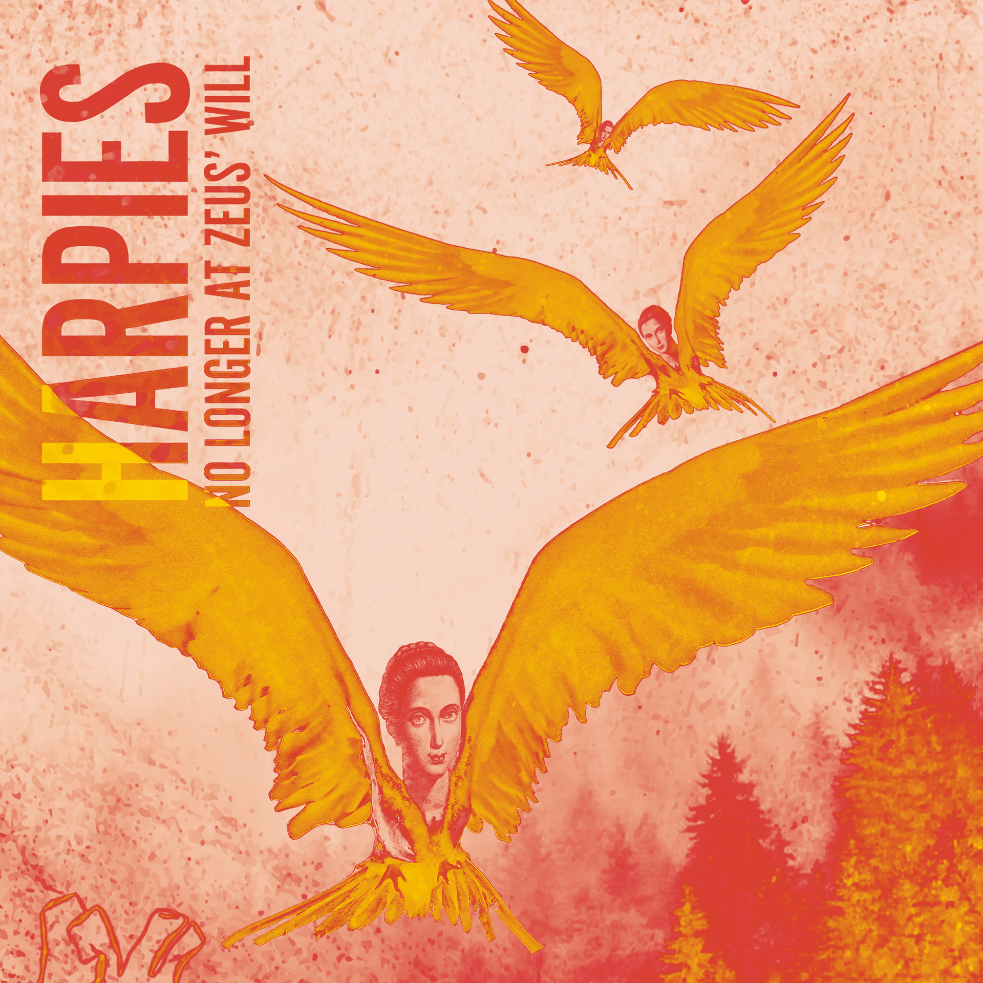
11 x 17 Poster Art & Design by Michelle Meyer
According to a normal workflow, moving from print to digital is much simpler than digital to print. My changes in color and arrangement, when changing geography and color space, took under an hour. I was able to maintain the concept design, variate the color and arrangement, and highlight a new digital hierarchy. The narrative is consistent, but the hierarchy's focuses on the copy, with little support or competition from the other elements. This copy treatment gets to the point in an oversaturated medium.
My Process
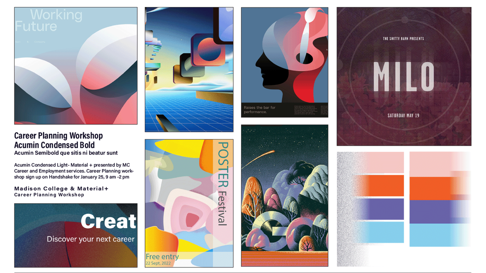
Moodboard by MICHELLE MEYER
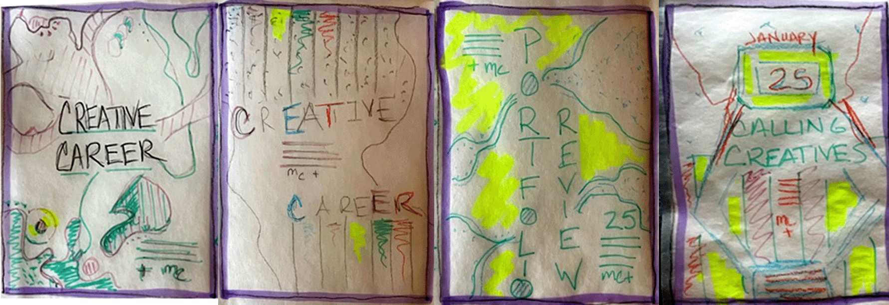
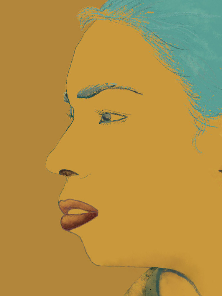
Sketches by MICHELLE MEYER

Event Details
